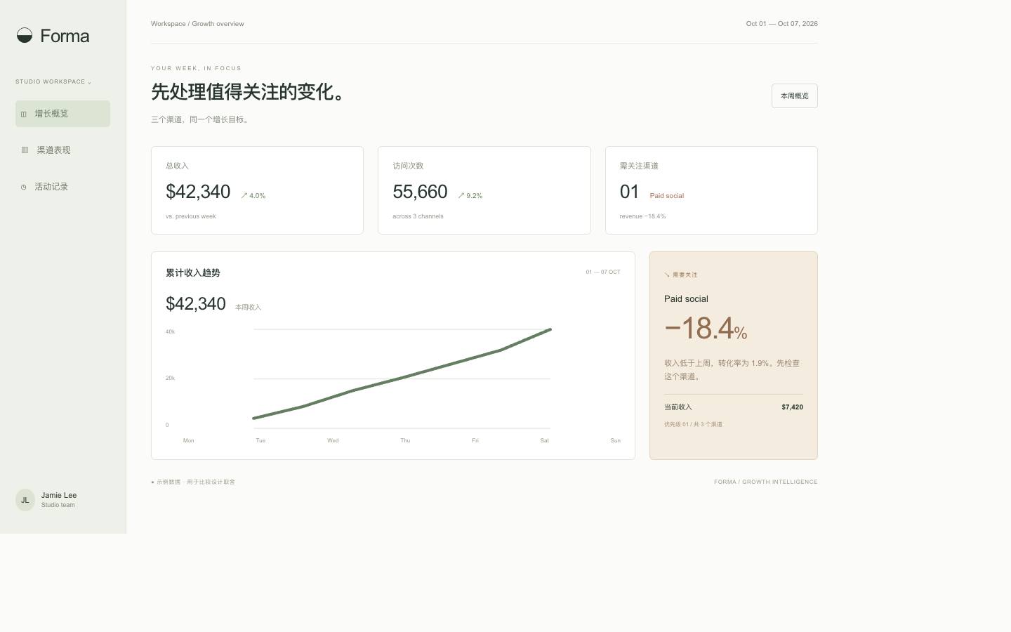
 A
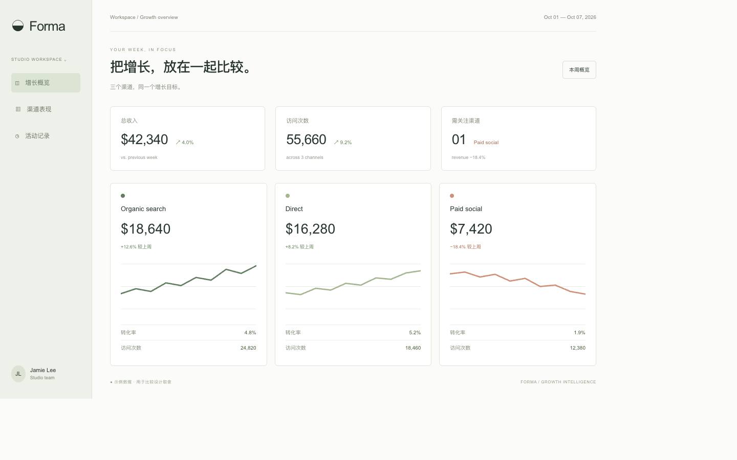 B
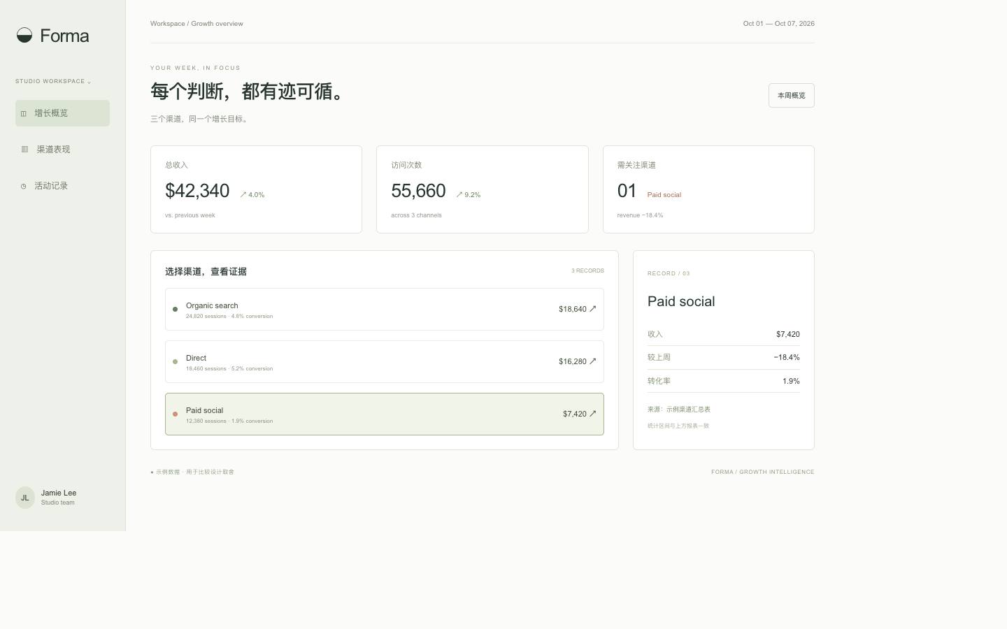 CForma: one dataset, three ways to decideThe same week of growth data, leading with the signal, a channel comparison or the evidence.
The same week of data under a locked brand, leading with what to act on, a side-by-side comparison, or tracing why.
Made with the skill · verified By Variant Design · 2026-10-27
Redesign the weekly analytics report of a subscription app for the product lead on Monday morning, with brand fonts and colors locked.
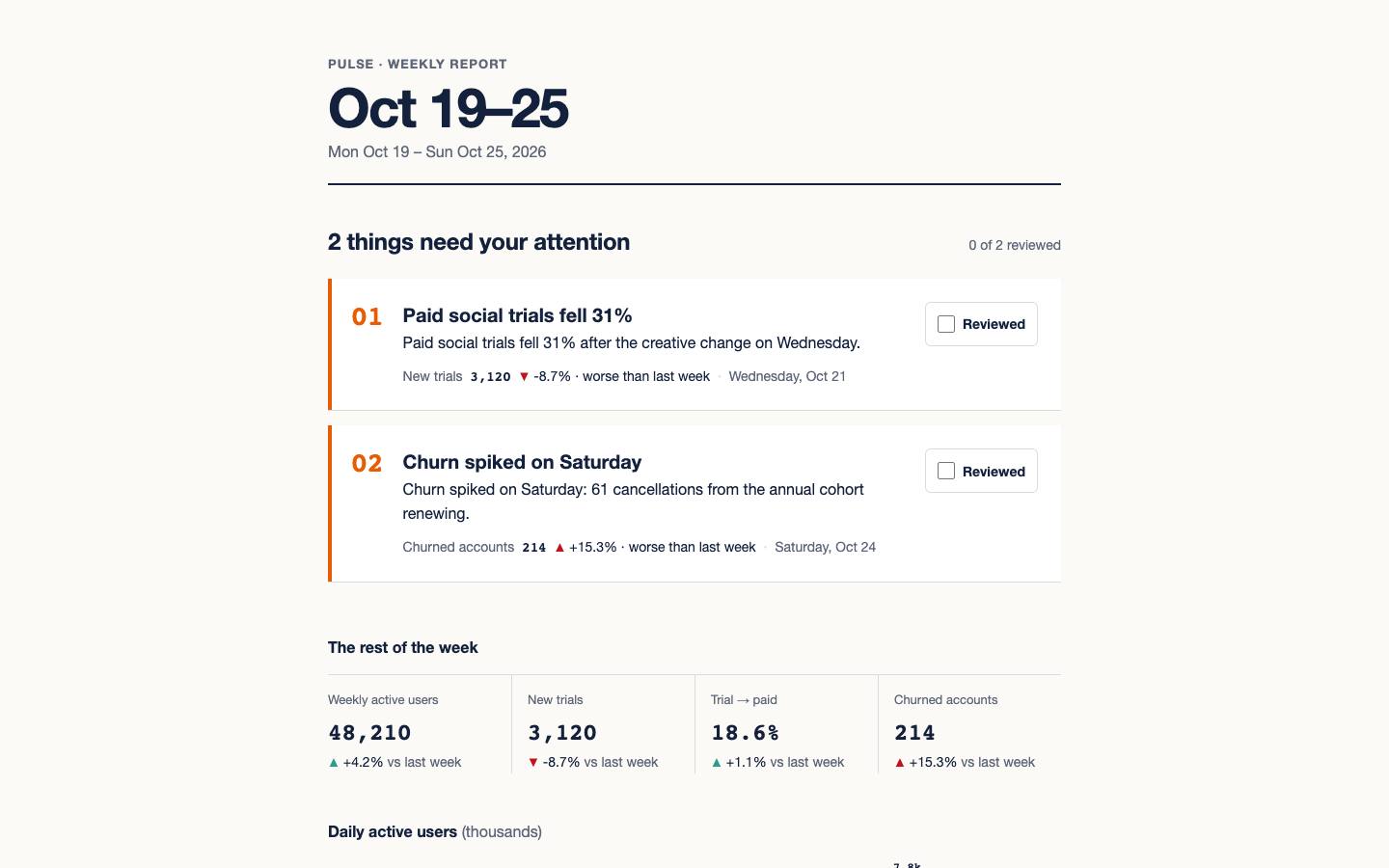
Install the skill, then paste this into the agent in your project. It reads the card, then makes three versions with your own brand and data. Install →
The direction notes and recommendation match the skill’s recorded output word for word. View the output record ↗
ABCForma: one dataset, three ways to decideThe same week of growth data, leading with the signal, a channel comparison or the evidence.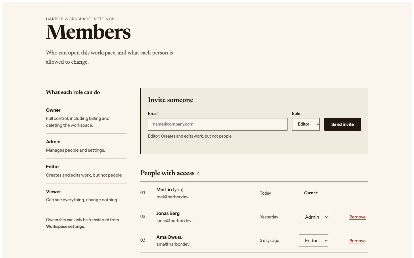 A
 B
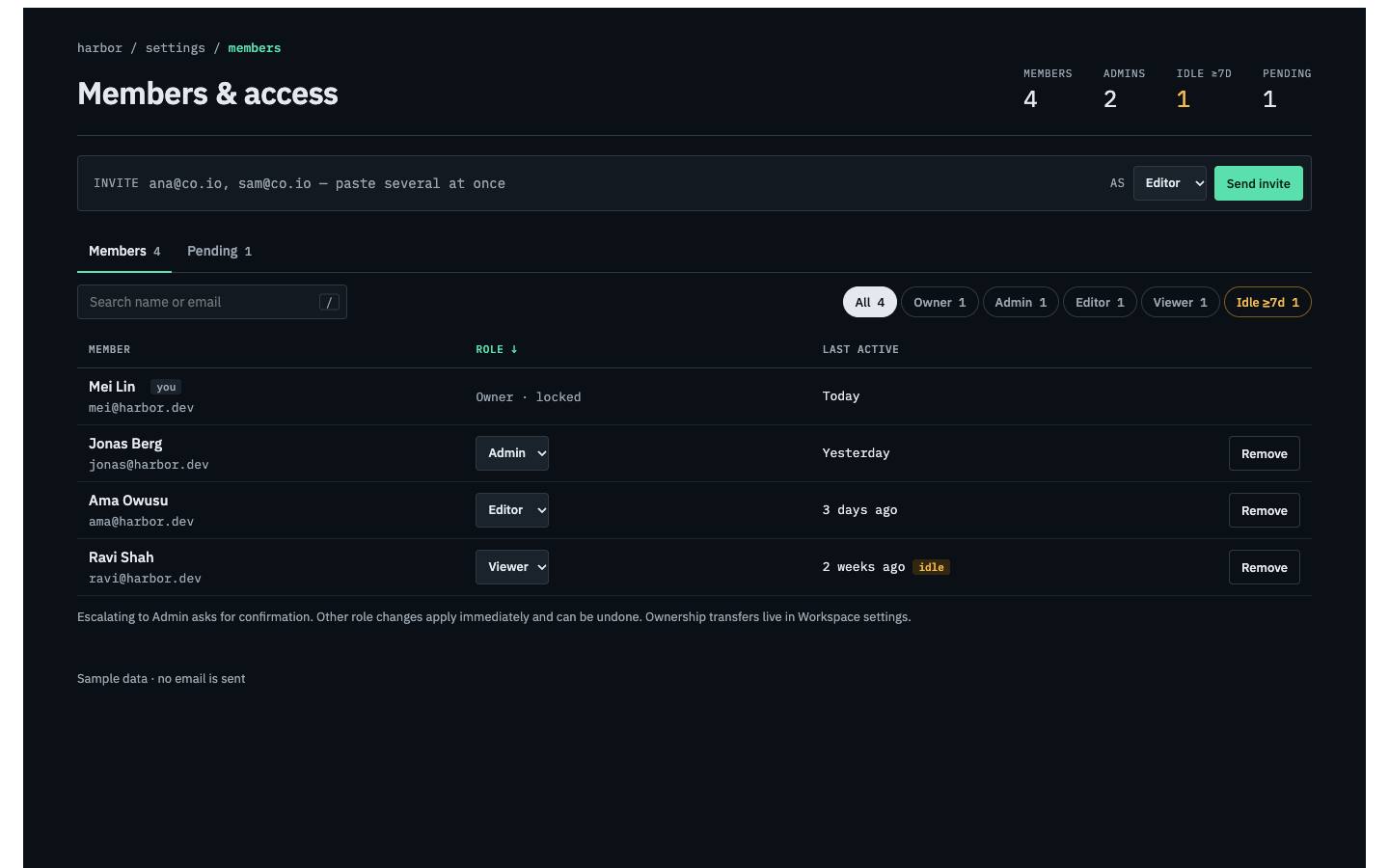
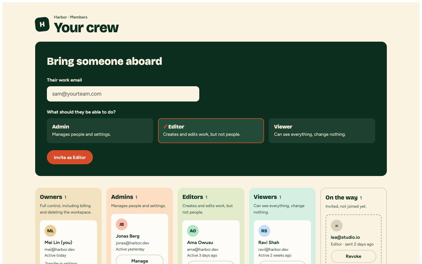 CHarbor: three ways to manage members and accessOne members page, leading with the consequences of a change, bulk speed, or inviting and onboarding.
 A
 B
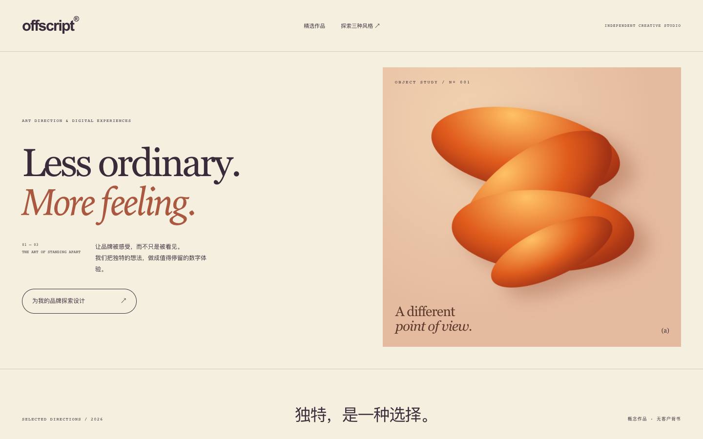
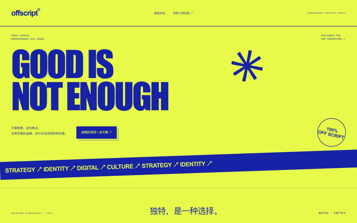
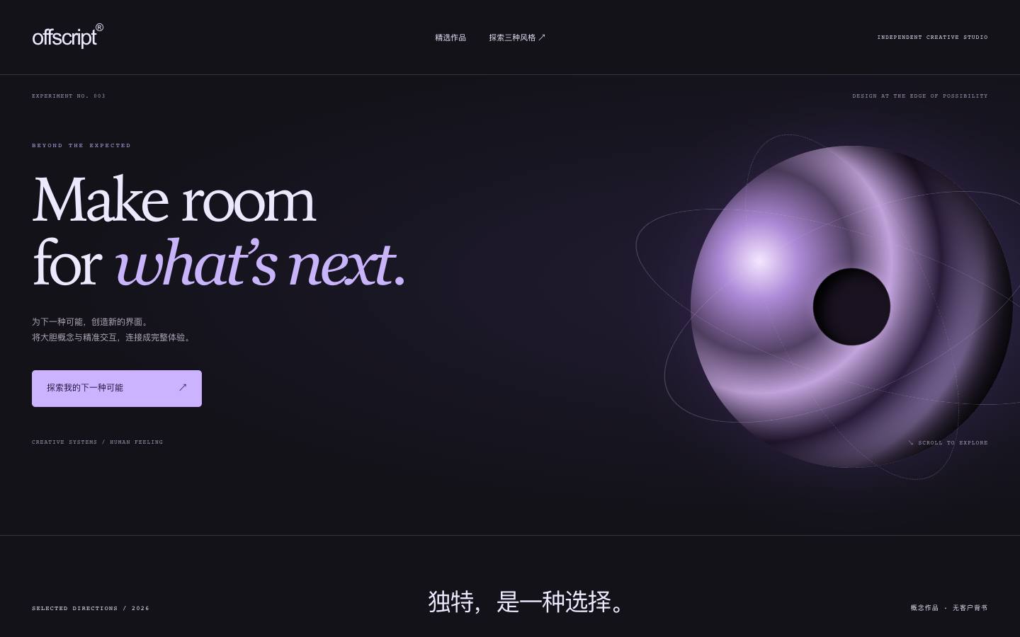 Coffscript: one brand, three personalitiesOne independent creative studio, introduced in an editorial, an unconventional and a future-facing voice.